

OVERVIEW
BACKGROUND
healthcine is a mobile app that lets users set reminders to take their medications on-time. It keeps track of dosages and the amount of time users have taken their medications to ensure they take the right amount as recommended at the best time of the day. healthcine allows users to set repeated or single reminders and add their own medication, in case it’s not listed in the app.
GOAL
Allow healthcine users to set a reminder for taking medications, mark as complete, and see analysis.
PROBLEM
Those who are busy or gradually developing memory loss need to be reminded not only to take their medications but also to track how much they have taken over a period of time.
DURATION
February 2022
MY ROLE
UX Designer - from conception to marking off a schedule.
MY RESPONSIBILITIES
Conducting interviews, paper and digital wireframing, low and high-fidelity prototyping, conducting usability studies, accounting for accessibility, and iterating on designs.
USER PAIN POINTS
TIME
Busy young adults & adults who don’t have this activity at the top of their head.
ACCESSIBILITY
Most platforms for medication reminders offer limited knowledge and don’t provide history and analysis. They’re mostly also not equipped with assistive technologies & language options.
IA
Text-heavy menus in apps are often difficult for the eyes.
I conducted interviews and created empathy maps to understand the users I’m designing for and their needs. A primary user group identified through research was busy young adults/adults and those who are gradually developing memory loss.
This user group confirmed initial assumptions about healthcine’s customers, but research also revealed that time and memory loss were not the only factors hindering users from taking meds. Other user problems included lack of dosage and ingredients knowledge, overview history analysis, and challenges that make taking meds not a top daily priority.
PERSONA: VIVIENNE CHOI
Problem Statement: Vivienne is a marketing manager and a small business owner who’s planning a wedding with her fiancé. She already has a lot on her plate and taking her meds is just not her top priority right now.


USER JOURNEY: VIVIENNE CHOI
Mapping Vivienne’s user journey revealed how helpful it would be for users to have access to a dedicated healthcine app.
COMPETITIVE AUDIT
An audit of a few competitor’s products provided direction on gaps and opportunities to address with the app.

IDEATION
Taking the time to draft iterations of each screen of the app on paper ensured that the elements that made it to digital wireframes would be well-suited to address user pain points. For the product description I chose to add bubbles for a more compact overview of the medications for efficiency.


INITIAL UI DESIGN AND WIREFRAME
I conducted two rounds of usability studies. Findings from the first study helped guide the designs from wireframes to mockups. The second study used a high-fidelity prototype and revealed what aspects of the mockups needed refining.
The first usability study revealed that users think a search bar would be faster for them Users from abroad might need to add a medication manually since the list can’t contain every medication in the world.
The second usability study revealed that users feel more accomplished if they can mark a schedule as complete
HI-FI PROTOTYPE
The final high-fidelity prototype presented cleaner user flows for create a medication schedule. It also met users preferences to search and manually add their own medications.

ACCESSIBILITY CONSIDERATIONS
1
Provided access to users who are vision impaired through adding alt text to images for screen readers.
2
Easier-to-navigate buttons and icons for universal understanding.
3
Option to switch languages for user whose first language isn’t English.
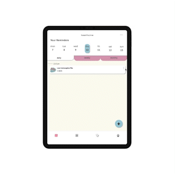
RESPONSIVE DESIGN
The designs for screen size variation included mobile, tablet, and desktop. I optimized the designs to fit specific user needs of each device and screen size.


TAKEAWAYS: IMPACT
The app makes users feel like healthcine really thinks about how to cater to their needs and preferences.
One quote from peer feedback: “As someone who has vision impairment, this app is so pleasing to the eyes and mind! This definitely will be my go-to reminder app.”
TAKEAWAYS: WHAT I LEARNED
While designing the healthcine app, I learned that the first ideas for the app are only the beginning of the process. Usability studies and peer feedback influenced each iteration of the app’s designs.
NEXT STEPS
1. Conduct another round of usability studies to validate whether the pain points users experienced have been effectively addressed.
2. Conduct more user research to determine any new areas of need.